Under | Student's bar
The university launched a design competition for Multimedia Design students to modernize the outdated identity of its student bar, formerly "The Basement." The challenge was twofold: propose a new name that resonates with an student community and design a fresh logo to replace the original.
Context
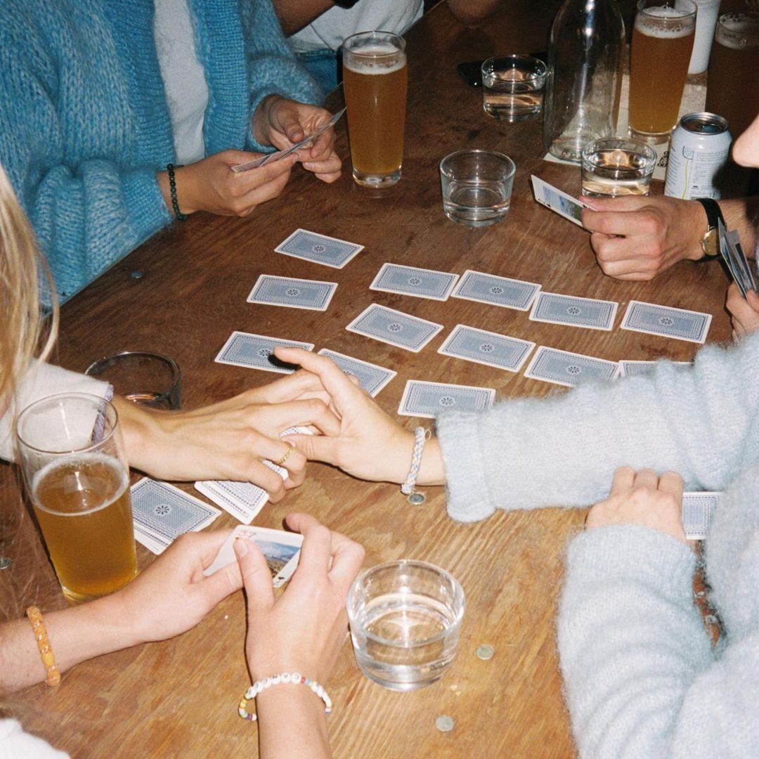
The goal was to transform the perception of the space from a "dark cellar" into a bright, social hub. By developing an inclusive and youthful identity that feels open and full of light, the brand builds trust and attracts a larger student community.
This strategic shift was designed to increase foot traffic and student engagement, ultimately driving higher consumption and generating measurable economic benefits for the university.
Objective
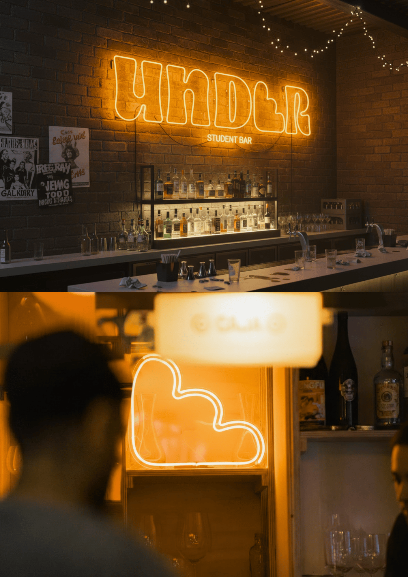
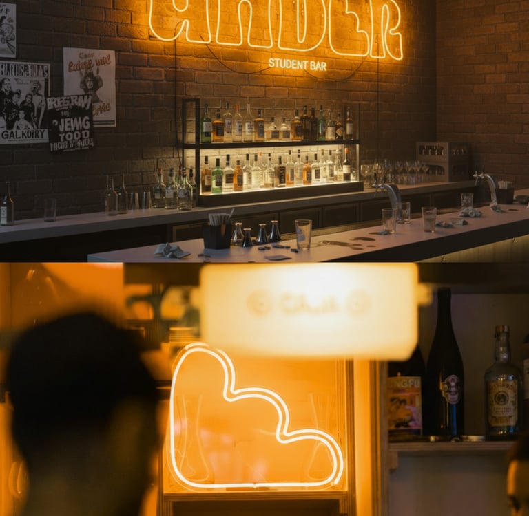
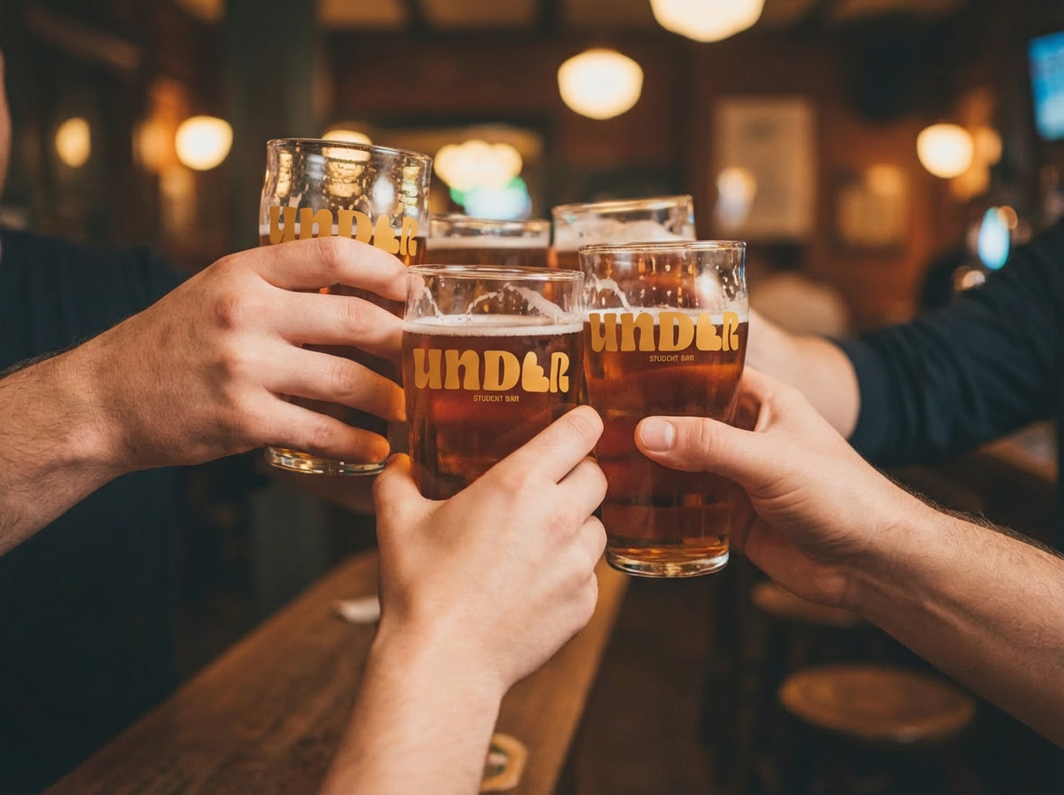
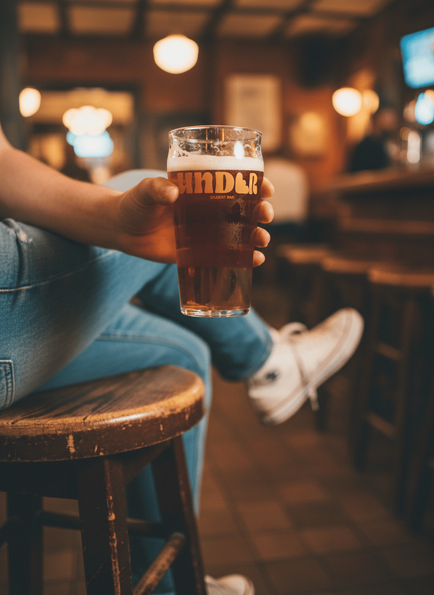
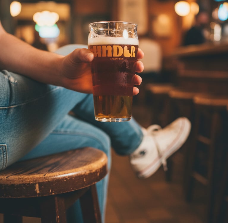
Strategic renaming: After exploring options like The Hideout or Below, I proposed UNDER. It’s a punchy, bilingual word that describes the location while suggesting a deeper meaning: "going under the surface" to escape the stress of classes and connect with others.
Process
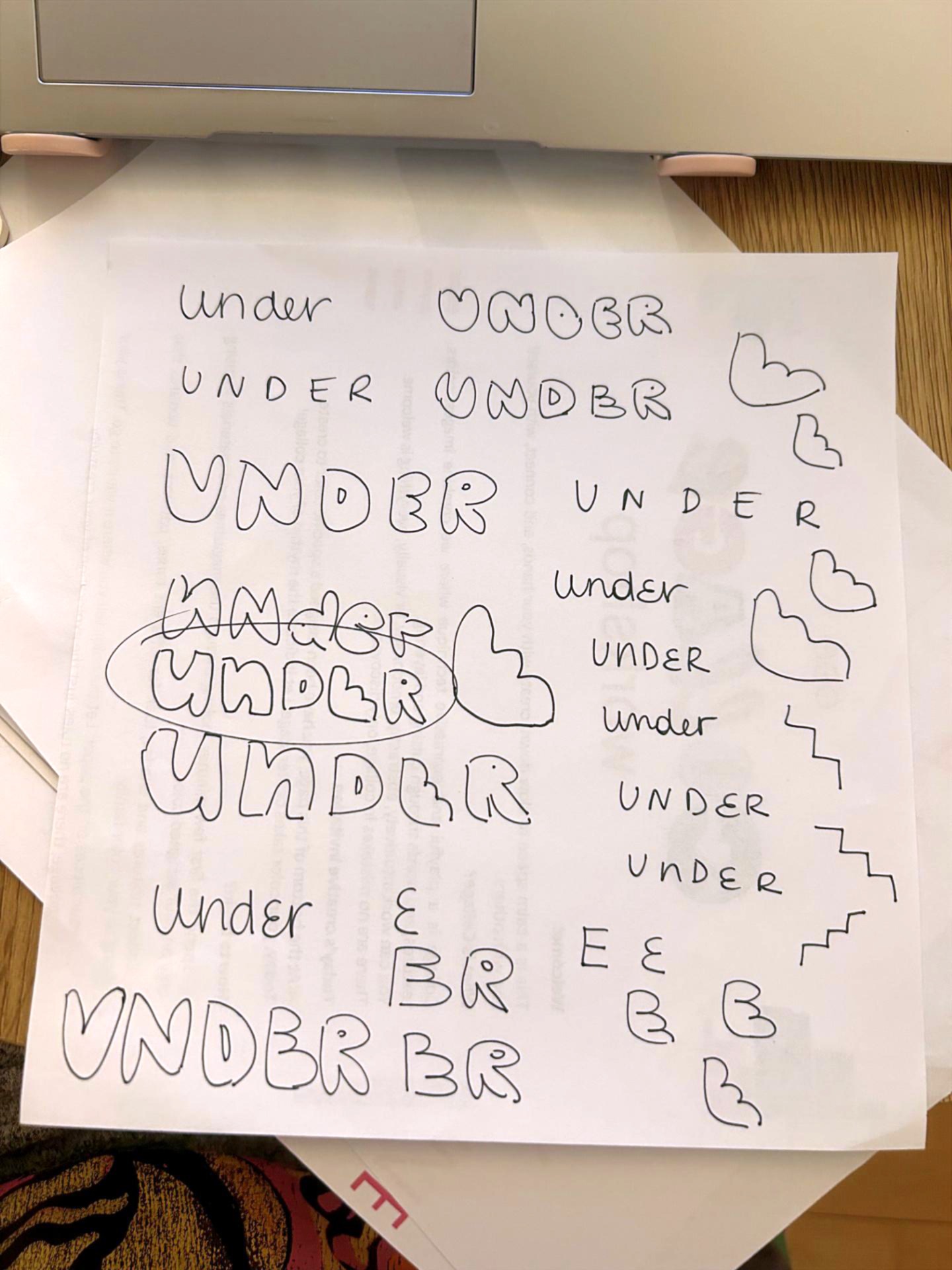
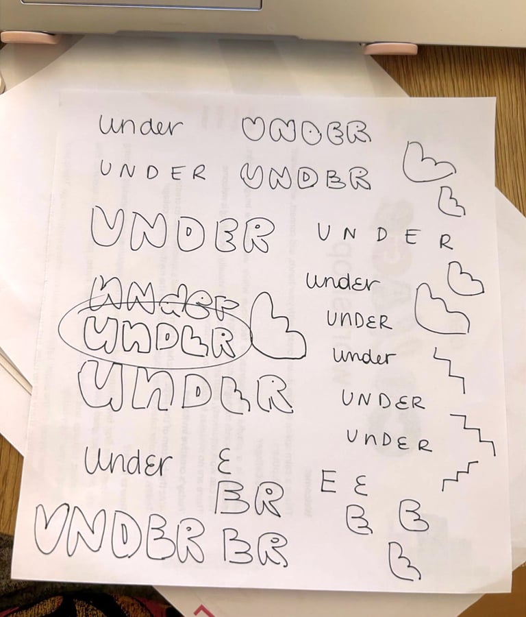
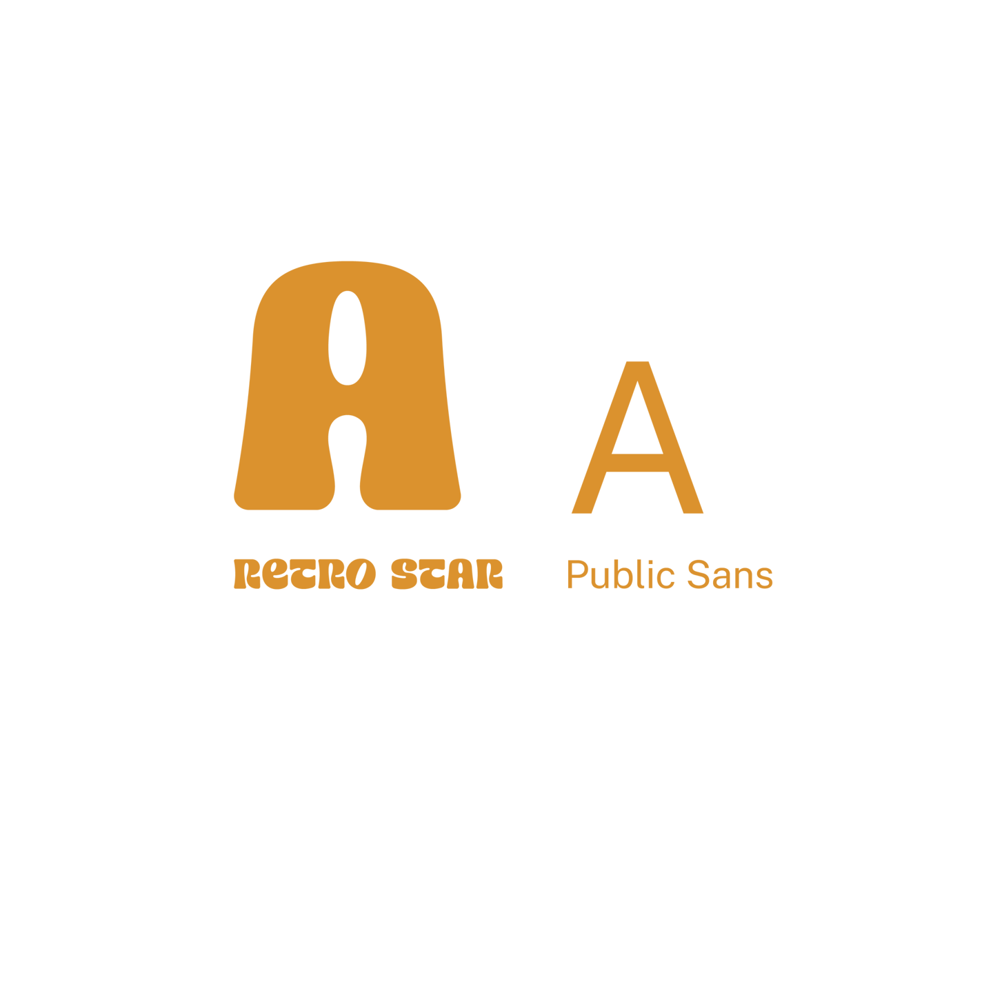
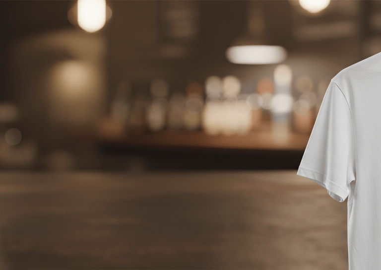
Design strategy: Knowing the bar needed to feel welcoming and approachable, I immediately gravitated toward a bold, rounded typography. The weight of the letters conveys confidence and strength, while the soft edges make the brand feel friendly and close to the student community.


The palette was a strategic choice to shift the bar's mood through color psychology.
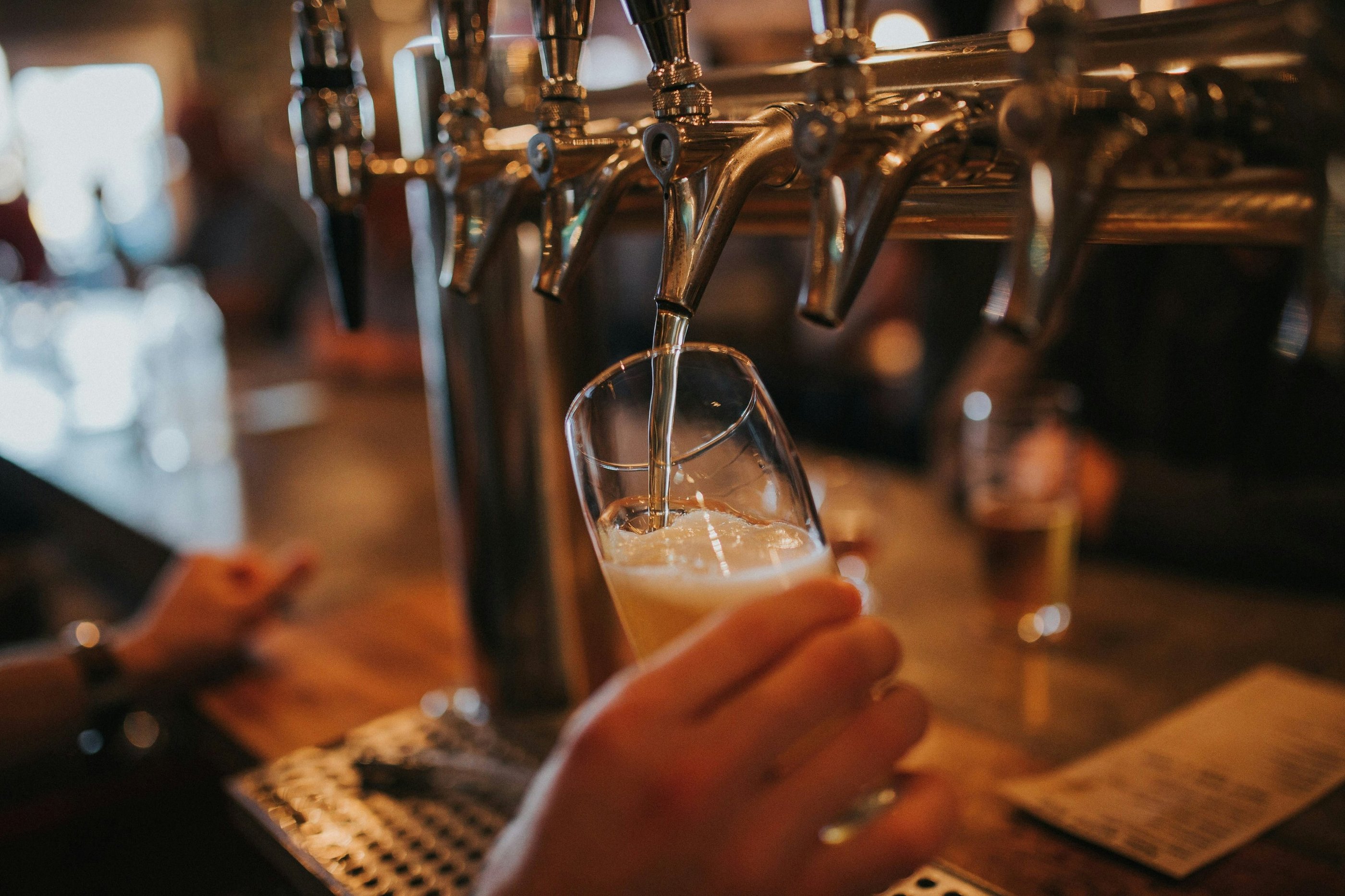
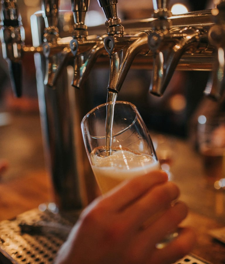
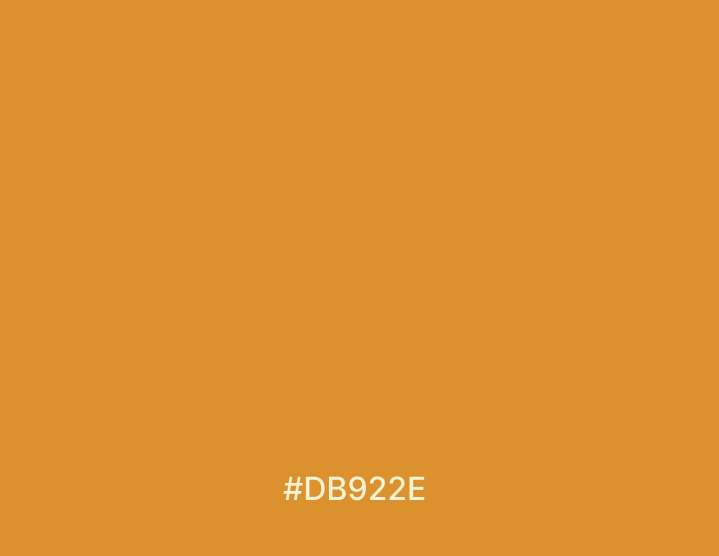
Amber & gold: This vibrant mix radiates energy and warmth, serving as the perfect antidote to a "dark basement" stigma. It creates a subconscious link to the golden hue of a fresh beer, the heart of "the taste of meeting up."
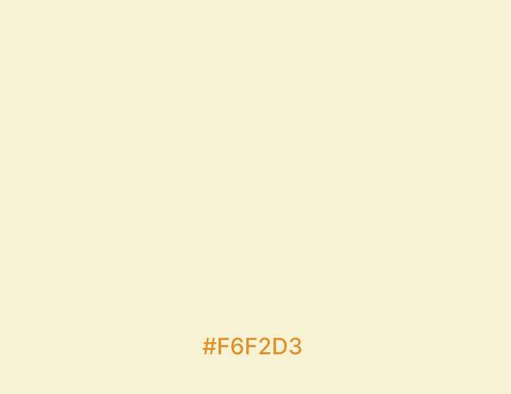
Cream accent: Inspired by the foam of a perfect pour, this soft neutral balances the high-energy amber. It adds an organic, sophisticated layer to the identity, ensuring the brand feels "light" and easy on the eyes.
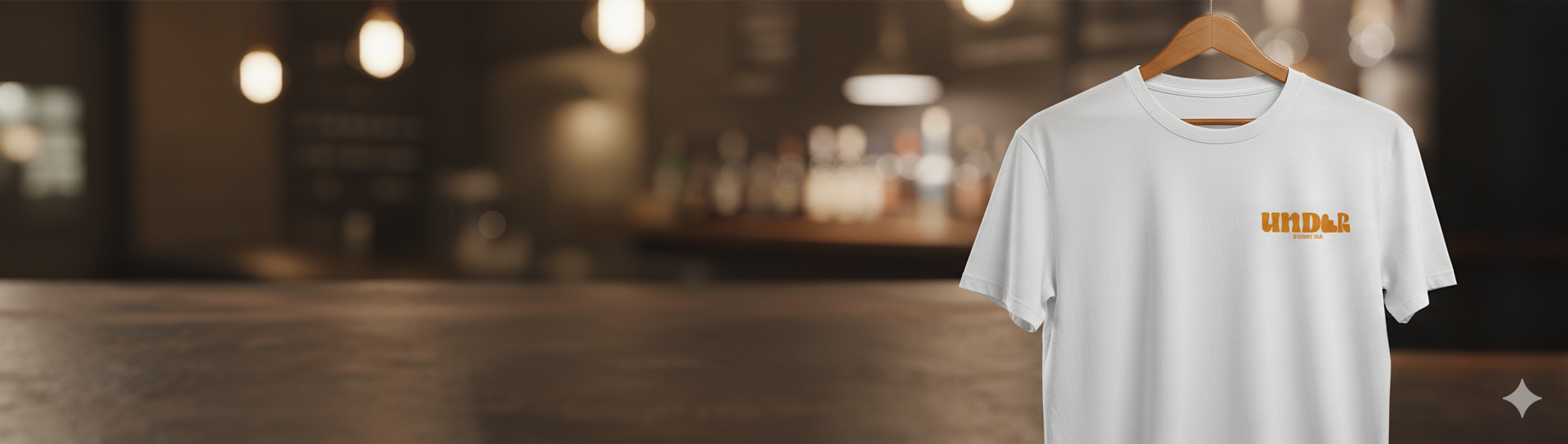
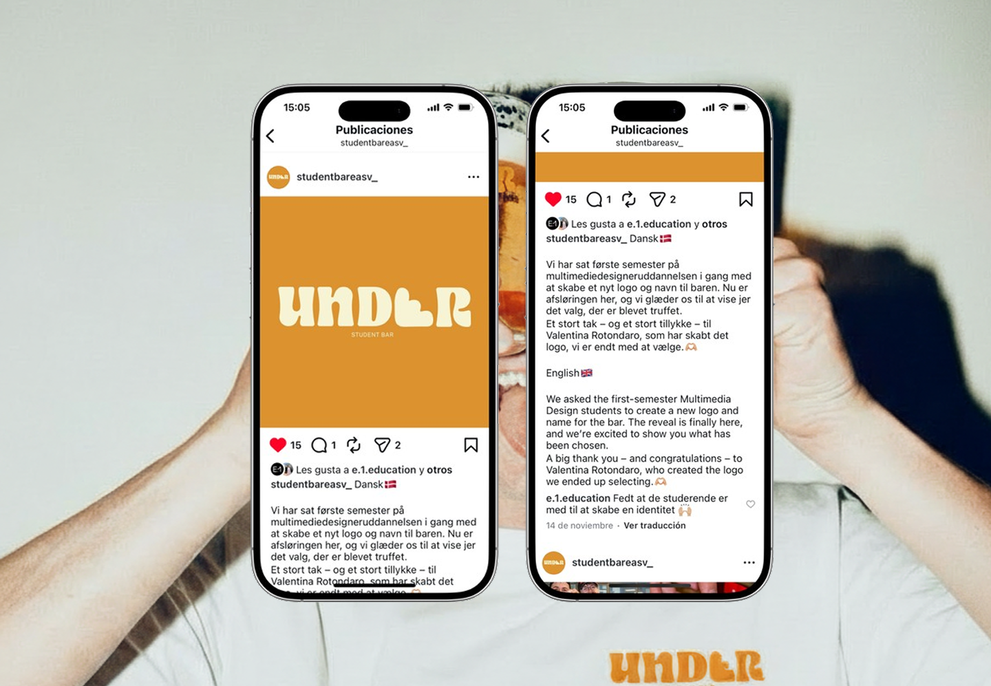
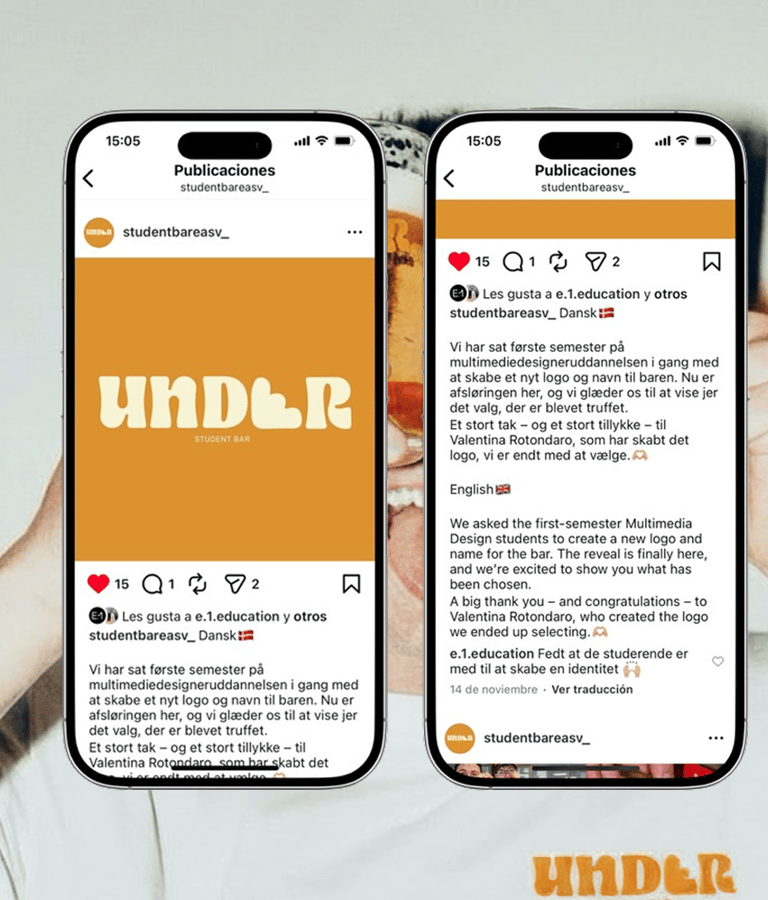
The final identity successfully redefined the student experience, transforming a physical space into a high-energy social hub. My proposal was selected as the official logo of the bar because it provided a strategic solution to a commercial challenge:
Market growth: The brand's new clarity and warmth were designed to increase foot traffic and student retention.
Commercial Appeal: By shifting the perception from a "dark basement" to an "inviting home," the new identity directly drives higher consumption and community engagement.
Scalable Success: The university chose this direction as it offered the most effective framework for future merchandise and social media growth, ensuring long-term economic benefits for the venue.